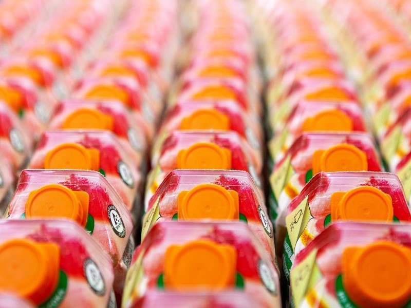
In-store decisions are made quickly. Within the initial 3-5 seconds a shopper will have decided whether to pick up a product or move on. That doesn’t leave a lot of time for your brand to be noticed, especially in categories with many me-too products. Those few seconds are vital as shoppers scan aisles and use heuristics in a bid to narrow down their options and get on with the rest of their day.
Green denotes vegetarian but how can you stand out?
For example, imagine you were looking for a vegetarian food product. In many countries vegetarian/vegan products are represented by the colour green and the packs feature elements that refer to nature, such as flowers or leaves, so if we wanted to launch a new product that can be quickly identified as vegetarian or vegan we would use this same type of imagery for our pack. This is a so-called dominant code as it’s firmly established, so much so that it almost becomes a hygiene factor to be part of the category.
But think about a market where all products use the same visual cues: how could we stand out quickly in a sea of ‘cold’ green leaf icons and increase our chance to be seen and picked by our imaginary grocery shopper then? And being noticed becomes particularly important when we consider that around 80-90% of new products fail at launch.
Going back to our example, packs in the vegetarian/vegan category tend to communicate significantly less about elements like taste and emotions. When taste is cued this is more often than not in comparison with its meaty equivalent, almost as an afterthought to reassure those buyers on a health kick that the product will look or taste just as good as the original meat version.
Disrupting the category
This category also often ramps up clinical and rational aspects and promotes health by exclusion (‘free from’) rather than signalling a treat or something more special – so if we wanted to disrupt the category we could apply a new trend or association that is not firmly established yet (a so-called emergent code) and cue ‘warmer’ emotional elements, for example showing the context in which the product is being consumed (a table with a family around it cueing comfort). Or perhaps we could wrap our product in a black, glossy material for the pack to cue luxury and a special, indulgent occasion.
Semiotics makes your packs work harder
This is what semiotics does – it looks at signs and symbols around us and what they mean, and in the context of new product development adding a semiotic analysis module to your research project can help you fine tune your offering ahead of launch.
Semiotics can also help you improve your current products and communications – are you reducing cognitive load for shoppers when evaluating products? Are you sending the right signals to push your sales in the right direction? If you are operating across different countries is your pack adapting to different cultures enough, or is it alienating local customers?
Your product communicates with shoppers whether you planned it or not - knowing what cues your product conveys and how this compares with the offer currently available on the market is paramount. To find out how we can help you make your pack design and communications work harder with semiotic analysis get in touch today for a free conversation with one of our analysts.
